Dashboards are often impressively useless, as Paul Cothenet explains very well in his post The law of shitty dashboards.
I created the dashboard below with designer Stephen McCarthy to track a GOV.UK project. I’ve gone into more detail about the different elements below, but the most un-useless bit was the definitely the Performance element, particularly the part that showed how many people have to contact our site with problems.
Contact rate is a simple metric that wasn’t specific to our project, but the team found that having it visible on a regular basis allowed them to see how their work was affecting the user experience. And after one transition when the contact rate went up, the dashboard helped us to get support to put a post-transition analysis process in place to find out whether new content was working.
At GOV.UK we’re moving agency and HMRC sites onto GOV.UK. This dashboard made the progress of agency transition and product development visible to all team members, and also monitored GOV.UK performance to make sure user experience wasn’t negatively affected as a result of transition.
Enable transition of arms-length bodies to GOV.UK

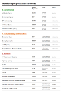
We can see what stage the agencies were in transition – the ‘blocked’ label indicates where agencies need new functionality to be developed before they can fully meet the needs of their users with GOV.UK content. ‘Feature-ready’ means the agency is ready to go – they just need to transfer content across to GOV.UK before they can re-direct traffic to us. The phases give us a more detailed view about how far agencies are away from transitioning.
Ensure that we’re meeting the needs of new users

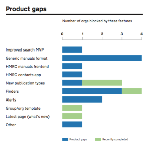
The Product gaps module allows us to see what products are blocking each agency from transitioning, and the stage of development for each of them. This helps the Product gaps team to measure their progress. It’s also useful for Transition Managers to:
- communicate progress to their agencies
- work out expected go-live dates
- have a view of functionality that may be useful to agencies beyond those noted on the dashboard
Ensure that we’re not degrading the experience of new and existing users

After new products are created and agencies are transitioned, we need to check that the performance of GOV.UK isn’t affected (or gets better). The main way we do this is by looking at the number of people (citizens and government colleagues) who use the feedback form on each content page, as they’re usually reporting a problem with the site.
The contact rate would ideally go down regardless of changes to the site, but as long as contacts only increase in line with traffic we’re happy. If contact rate goes up we need to do deeper content analysis to find the problems and fix them. We also look at site search exits to show where people aren’t finding what they need from GOV.UK search results – this percentage shows those who exit the site after searching on GOV.UK rather than clicking on one of our results.

The user quotes allow us give a voice to the common themes that come out of user research. These need to influence product development, and post-launch they help us to reveal problems or successes that may have contributed to changes in performance. They also humanise our ‘objectives’ – reminding us that the most important purpose of our work is to give people easy access to the government services they need.
If you’d like your own dashboard, check out our dashboard packages on offer.

Pingback: Links from around GDS for 3rd October 2014 | Technology at GDS
Pingback: MuseumNext - The Museum Dashboard