Do you want to get past data confusion and vanity metrics, and let your data tell a meaningful story?
More of us are turning to dashboards for a clear picture of our online performance. It takes too long to grapple with the puzzle-box GA4 interface, and dashboards provide a clear view of our GA4 data.
AI and social platforms are changing that way that people find and engage with our content. Engagement often happens outside our website, and dashboards provide a holistic view of all our data sources.
Here are some principles I use when creating dashboards:
- Dashboards show high-level changes, not diagnostics.
- One-page dashboards are often enough.
- Let your filters do the heavy lifting.
- Find out exactly what your GA4 measure is telling you.
- Live with inaccuracies and contradictions.
- Integrate different data sources to tell the whole story.
Start with questions, not measures.
Dashboards provide the context that KPIs can’t, which is necessary when so many factors are out of our control. They need to reflect our goals, the platforms we operate on, and user needs and behaviour.
Dashboards show high-level changes, not diagnostics.
Dashboards show you what has happened, but not always why it happened. You want just enough information to investigate further, by following in the shoes of your user and digging deeper into your data.
Example: this RNZ dashboard shows the performance of RNZ’s radio programme ‘Saturday’. The content changes week-to-week, and and is promoted through different social channels, and the dashboard provides a feedback loop to the producers.

One-page dashboards are often enough.
It’s tempting to put every measure you think could be useful on your dashboard, but this will dilute your story. You want to choose only the measures that give the most insight. If you need more pages, try to tell the main story on the first page.
Dashboards wil gather dust in the ‘too hard’ basket if they contain too much data and don’t tell a clear story.
Related: use plain language in your dashboard labels, so that everyone can make sense of them.
Let your filters do the heavy lifting.
You can get a lot of insight with a clever use of filters.
Filter by traffic channel to reveal your audience and inform marketing activities. For example Google traffic has strong intent and they are more likely to engage, whether Facebook traffic is curious and often less engaged.
You can create Audiences in GA4, which are custom filters, and pull them automatically into Looker Studio. Filter for users who visit certain content sections, for example only show those users who have visited the ‘About-us’ section on your site.
On large content-driven sites that cover diverse topics this kind of filter might be necessary to get useful insights.
Example: the Te Papa dashboard below shows a ‘New Zealand Sign Language (NZSL)’ filter applied to only show data from users who view this content.

Find out exactly what your GA4 data is telling you.
There are so many measures in GA4. Slightly different measures tell different stories, and we get different answers for the same questions depending on which report we use.
Research the meaning of each measure to make sure that you’re telling an accurate story. Use the exact measure labels on the dashboard, and consider creating a data glossary for other people to use.
Related: use ‘Sessions’ and ‘Users as metrics’ carefully. Try to choose one for consistency, but be aware that you can only get some insights using Sessions and some using Users.
Live with inaccuracies and contradictions
New cookie regulations and increased user anonymisation means that Google Analytics data it’s even less accurate than in the past. But this isn’t a terrible thing, because we get the most value from high-traffic trends, not getting fixated on exact volumes and small anomalies in our data.
Likewise, data from different platforms won’t match. Facebook referral volumes to your website will be different in GA4 data vs Facebook data.
Integrate different data sources to tell the full story.
Our stories are increasingly happening outside of our websites. We can’t reliably see the number of times that our content appears in AI summaries. Fewer people are discovering us in Google, and more through social platforms. People are now able to purchase products directly through AI.
GA4 data isn’t enough. We need to bring in the full picture of our performance with social data, transaction data, call centre data and other sources. Steve Ganem from Google has said that it will soon be easier to connect different data sources to GA4.
Example: this GOV.UK dashboard pulls in data on project progress, user research quotes, on-page feedback and GA4 data for the holistic picture of performance. When government complaints increased we were able to use the dashboard to get senior buy-in to address the problem.

Start with questions, not measures.
When I gather needs for a dashboard, I don’t ask for a list of measures. I ask questions about a client’s digital activities, goals and audiences, to understand the purpose of the dashboard. The right measures only becomes really clear when you get data on the dashboard, and can mould it to tell a good story.
Related: avoid measures that don’t change regularly. For example you might not need mobile vs desktop visits unless your organisation needs a wake up call.
Dashboards should reflect your goals, whatever they may be.
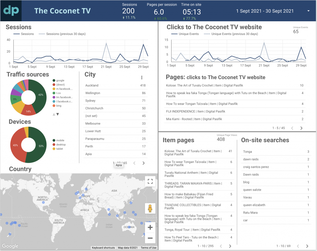
Lastly, I have to finish with my favourite unusual dashboard. While most people want to keep people on their website for as long as possible, the generous folks at Digital Pasifik want to send their traffic off to other sites. See the Digital Pasifik dashboard for more.
Dashboards might look similar to each other but tell very different stories!
Featured image by Etienne Girardet on Unsplash.

